Fitting curves to data using Ruby and the GNU Scientific Library
In this post I'll show you how to use the GNU Scientific Library and its Ruby bindings to fit curves to data. This technique is useful if, for example, you want to extrapolate into the future on the basis of some past information.
By way of example, your boss approaches you with some historic revenue figures from your new Web 2.0 venture, and asks you to predict future growth. Let's generate some example data to play with:
require 'gsl'
time = GSL::Vector.linspace(0,24,100)
revenue = GSL::Vector.linspace(0,1,100).collect{|yi| yi+rand()/10}
In this code we're using the GSL Vector class to represent time. Here we have a vector of months representing two years of data (24 months). The linspace method causes our vector to have 100 evenly spaced elements between 0 and 24.
We concoct some revenue data using GSL::Vector again. The GSL Vector class does not implement all of methods found in Ruby's native array class, but does have 'collect'. Here we create a random scattering of points.
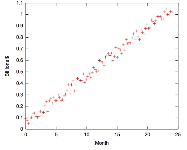
Let's visualise this data first to see what we are dealing with. To do this we have a number of options, here I'd like to show how we can use Gnuplot to do the visualisation.
First install the gnuplot gem:
$ gem install gnuplot
You'll need to have gnuplot installed to use the bindings. Binary packages are available for many platforms, just make sure that gnuplot is in your path after installation. OS X users should install aquaterm to allow plotting to a desktop window.
Now let's plot the data generated above:
require 'rubygems'
require 'gnuplot'

Gnuplot.open do |gp|
  Gnuplot::Plot.new( gp ) do |plot|

    plot.title  "Company turnover"
    plot.xlabel "Month"
    plot.ylabel "Billions $"

    plot.data << Gnuplot::DataSet.new( [time.to_a, revenue.to_a] ) do |ds|
      ds.with = "points"
      ds.notitle
    end

    plot.terminal "svg"
    plot.output "revenue.svg"
  end
end
The code above generates the following graphic in SVG format.

Gnuplot has a number of output formats, known as "terminals" to choose from including one which plots straight to screen - great for rapid exploration of data.
Looking at the data, we see that a straight line drawn through the points would be a good model for the growth in revenue. We can use GSL's line-fitting tools to perform this fit for us:
(c0, c1, cov00, cov01, cov11, chisq, status) = GSL::Fit::linear(time,revenue)
revenue_fit = (time * c1) + c0
puts c1
puts c0
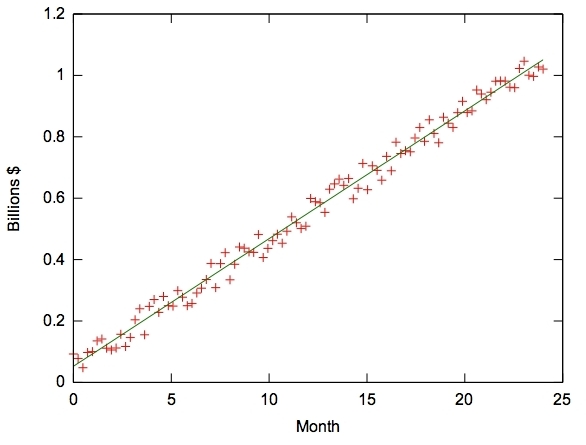
The value of c1 is the growth rate per month, in this case around 0.04 Billion $ per month! We have used a linear fit here, but the GSL provides many other fitting methods for more complicated data. A quick plot checks the goodness of our fit:
plot.data << Gnuplot::DataSet.new( [time.to_a, revenue_fit.to_a] ) do |ds|
  ds.with = "lines"
  ds.notitle
end
Add this snippet of code to the plotting function above (after the first plot.data and before the call to plot.terminal)

If you need to perform data analysis, provide graphics for your users in your webapp, or produce high quality plots I encourage you to investigate the combination of ruby, GSL and GNUPlot.